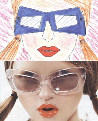
 It was just an inspiration from the Prada Eyewear Spring/Summer 2010 campaign. Though I am a novice at fashion design, I boldly decided to substitute the crystal transparency concept with bright coloring simultaneously enhancing the geometrical attitude that Prada promotes in accessories. I made these sunglasses’ design more angular with inverse widths in exterior and interior frame outlines. As far as the collared top, it’s far more enriched with linear and wavy double color pattern, the vertical part (blue) printed and the horizontal (green) embroidered. I hope you will appreciate my latitude to experiment, and I really enjoy the fact that i share it with by best friends, you!
Πειραματίστηκα σχεδιάζοντας κάτι που είδα σε μια επώνυμη καμπάνια και προσαρμόζοντάς το στις δικές μου προτιμήσεις. Χαίρομαι πολύ που μοιράζομαι έναν από τους πρώτους πειραματισμούς μου στο σχέδιο με εσάς, τους αναγνώστες μου!
[nggallery id=32]


